Web Design using Figma

In today’s world, having a great website is super important. Whether it’s for a business, a blog, or a school project, a well-designed website can make a big difference. One of the best tools for designing websites is Figma.

This guide will help you understand what Figma is, why it’s awesome, and how Web Design using Figma works.

What is Figma?

Figma is a tool that helps people design websites and apps. It works right in your web browser, which means you don’t need to download anything special to use it. You can access Figma from any computer as long as you have an internet connection. This way, Web Design using Figma makes it convenient, especially if you switch between different computers at school and home.

Web Designing Using Figma

Key Features of Figma

1. Real-Time Collaboration

One of the coolest things about Web Design using Figma is that it lets multiple people work on the same design at the same time. This is great for group projects because you and your friends can all work together, see each other’s changes instantly, and give feedback right away.

2. Easy-to-Use Tools

Figma has lots of tools that make designing easy. You can create shapes, draw lines, and add text with just a few clicks through Web Design using Figma. It’s like using a digital version of drawing tools, but with way more options and flexibility.

3. Prototyping

Prototyping means making a simple version of your website to see how it works. Figma lets you create clickable prototypes, so you can test your design and see how it feels to use. This is super helpful for making sure everything looks and works the way you want before you build the actual website.

4. Reusable Components

In Figma, you can create components, which are reusable parts of your design, like buttons or icons. Once you make a component, you can use it over and over again without having to design it from scratch every time. This saves a lot of time and keeps your design consistent.

5. Accessible Anywhere

Since Figma is web-based, you can use it on any computer. It doesn’t matter if you’re using a Windows PC at school or a Mac at home – Figma works on all of them.

Benefits of Using Figma

Enhanced Collaboration

Figma makes it easy to work with others. You can invite your friends or classmates to join your project, and everyone can work on the design together. This means you can get feedback and make improvements faster through Web Design using Figma.

Easy to Learn

Figma is designed to be user-friendly. Even if you’re new to web design, you’ll find it easy to learn. There are lots of tutorials and guides available online to help you get started.

Cloud-Based Flexibility

Because Figma is cloud-based, you don’t have to worry about losing your work. Everything is saved online automatically. Plus, you can access your designs from any computer with an internet connection.

Rapid Prototyping

With Web Design using Figma and its prototyping tools, you can quickly create interactive versions of your design. This helps you see how your website will look and function, making it easier to spot and fix any issues early on.

Consistency and Reusability

Using components and styles in Figma ensures that your design is consistent. For example, if you change the color of a button, all instances of that button will update automatically. This keeps your design looking neat and professional.

Best Practices for Web Designing with Figma
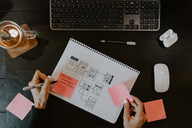
Web Design Wireframe

Start with Wireframes

Before you dive into detailed Web Design using Figma, start with wireframes. Wireframes are simple sketches of your website’s layout. They help you plan where things will go, like text, images, and buttons. Figma’s basic shapes and text tools are perfect for creating wireframes.

Use Components

Make the most of components to save time and keep your design consistent. Create components for elements you use often, like headers, footers, and buttons. This way, you only need to design them once and can reuse them across your project.

Create a Design System

A design system is a set of guidelines and reusable elements that keep your design organized and consistent. Define styles for things like fonts and colors, and use them throughout your project. This helps your website look cohesive and professional.

Collaborate and Gather Feedback

Share your designs with friends, teachers, or classmates to get feedback. Figma makes it easy to invite others to view and comment on your project. Use their feedback to improve your design and make it the best it can be.

Optimize for Performance

Designing a website isn’t just about how it looks – it’s also about how it performs. Make sure your design is optimized for fast loading times and works well on different devices. Use Figma’s layout grids and constraints to create responsive designs that adapt to various screen sizes.

Web Designing Using Figma

Conclusion

Figma is an exceptional tool for web designing, offering all the necessary features to create beautiful and functional websites. Its real-time collaboration capabilities enable multiple team members to work simultaneously on the same project, making the design process more efficient and cohesive. The ease of use, with its intuitive interface, allows both beginners and professionals to navigate and utilize its powerful features effectively.

Figma supports vector graphics, prototyping, and seamless integration with other design tools, enhancing the overall design workflow. By adhering to best practices and leveraging Web Design using Figma, designers can create impressive and innovative web designs that truly stand out. Its cloud-based nature ensures that work is saved automatically and can be accessed from anywhere, promoting flexibility and uninterrupted workflow.

Web Design using Figma provides a comprehensive suite of tools tailored to modern web design needs. One of its standout features is the ability to create and share interactive prototypes, which allows designers to showcase how the final website will look and function. This not only aids in visualizing the end product but also facilitates feedback and iterative improvements before development begins.

Figma’s design system capabilities enable designers to maintain consistency across different pages and projects by creating reusable components. Additionally, its extensive library of plugins and community resources provides endless possibilities for customization and enhancement, ensuring that designers can stay at the forefront of design trends and technological advancements.

At WEAMSE, we recognize the critical role that effective web design plays in the success of a website. Our expert UI/UX design team combines creativity with technical expertise to produce highly converting and unique websites tailored to meet our clients’ specific needs. We understand that each project requires a unique approach, and our team is adept at utilizing Web Design using Figma to bring our clients’ visions to life. Whether you are looking to develop a new website from scratch or redesign your existing site, our team is equipped to deliver exceptional results.

Our collaborative approach ensures that clients are involved at every stage of the design process, resulting in a final product that not only meets but exceeds expectations. Contact us today to embark on a journey of transforming your web design ideas into reality, ensuring a visually appealing and user-friendly online presence that drives engagement and conversion.

Web Designing Principles: Creating Effective and Engaging Websites

Creating an engaging and effective website web Designing requires understanding and applying key web design principles. These principles help ensure that a website is not only visually appealing but also user-friendly and functional. This article will explore essential web design principles focusing on size, spacing, color, alignment, typography, and imagery. By mastering these elements, you can design websites that capture attention and provide an excellent user experience.

I7NIUri1kbwsaj9B9q7 kbtrWQQ g0POx vgLpb PpgbW5QKdbnUntbkgBFHbA WEA7GTHk67XTh4a06H6QNG7EqkXbsm OVBH2eKRofNBwqbOHrVISe0eygBJqSo0yfetBDQU2zFu

1. Size

Size plays a critical role in web design as it helps create a visual hierarchy, guiding users’ attention to the most important elements first. Using size effectively can highlight key information, making it more accessible and easier to understand.

Creating Visual Hierarchy

Visual hierarchy refers to the arrangement of elements in a way that signifies their importance. Larger elements are typically seen as more important and are noticed first. For instance, headlines are often larger than body text to draw the reader’s eye.

  1. Headings and Subheadings: Use different sizes for headings (H1, H2, H3) to establish a clear hierarchy. The main heading (H1) should be the largest, followed by subheadings (H2, H3).
  2. Buttons and Calls to Action (CTAs): Make buttons and CTAs larger and more prominent to encourage user interaction.

Responsiveness

Ensure that size adjustments are made for different screen sizes. A responsive design adapts to various devices, providing a consistent and accessible user experience across desktops, tablets, and mobile phones.

2. Spacing

Spacing, also known as white space or negative space, refers to the empty areas between elements on a webpage. Proper spacing enhances readability, reduces clutter, and helps users focus on individual elements.

Enhancing Readability

Adequate spacing between text lines (line height) and around paragraphs improves readability. Crowded text can overwhelm users, making it difficult to read and understand content.

  1. Line Height: Use appropriate line height to ensure text is easy to read. A line height of 1.5 times the font size is generally recommended.
  2. Paragraph Spacing: Ensure there is enough space between paragraphs to differentiate them clearly.

3. Color

Color is a powerful tool in web design, impacting the mood, perception, and behavior of users. The right color scheme can enhance the aesthetic appeal, convey brand identity, and improve user experience.

Choosing a Color Scheme

Selecting a harmonious color scheme is essential. Colors should complement each other and align with the website’s purpose and target audience.

  1. Primary and Secondary Colors: Choose a primary color for the main elements and secondary colors for accents. This creates a cohesive look and feel.
  2. Brand Colors: Use colors that represent the brand identity. Consistency in color usage reinforces brand recognition.

4. Alignment

Alignment refers to the arrangement of elements in a straight line or in proper positions relative to each other. Good alignment creates order, improves readability, and provides a clean and professional look.

Types of Alignment

  1. Left Alignment: Commonly used for text, as it aligns naturally with the way people read from left to right.
  2. Center Alignment: Often used for headings, banners, and elements that need to be the focal point.
  3. Right Alignment: Less common but can be used for specific design elements to create a unique look.

5. Typography

Typography involves the selection and arrangement of fonts. It significantly affects readability, user experience, and the overall aesthetic of a website.

Choosing the Right Fonts

Select fonts that are legible and appropriate for the website’s purpose and audience.

  1. Serif Fonts: Have small lines or strokes attached to the end of letters. Often used for traditional and formal websites.
  2. Sans-Serif Fonts: Do not have small lines or strokes. Commonly used for modern and clean designs.
  3. Script Fonts: Mimic handwriting and are typically used for decorative purposes.

6. Imagery

Imagery includes photos, illustrations, icons, and other visual elements. High-quality images enhance the visual appeal and can convey messages more effectively than text alone.

Choosing the Right Images

Select images that are relevant, high-quality, and aligned with the website’s purpose and brand identity.

  1. Relevance: Ensure images support the content and context of the page.
  2. Quality: Use high-resolution images to avoid pixelation and maintain a professional look.
  3. Authenticity: Whenever possible, use authentic images rather than generic stock photos. Authentic images resonate better with users.

Enhancing User Engagement

Use imagery strategically to enhance user engagement and guide users through the website.

  1. Hero Images: Large banner images at the top of a webpage can grab attention and convey the main message.
  2. Thumbnails: Use thumbnails for galleries or portfolios to provide a preview of the content.
  3. Icons: Use icons to represent actions, categories, or features. They can make navigation more intuitive.

Conclusion

Understanding and applying the principles of size, spacing, color, alignment, typography, and imagery are crucial for effective web design. These principles help create visually appealing, user-friendly, and functional websites. By focusing on these key elements, you can design websites that not only capture attention but also provide an excellent user experience. Whether you’re designing a personal blog, a business site, or an online portfolio, these web design principles will guide you in creating engaging and effective websites.

5 Features must to add while web development

In the digital age, a website serves as the face of your business or personal brand. Whether you’re a budding entrepreneur, an established corporation, or an individual looking to showcase your portfolio, the significance of a well-designed website cannot be overstated. In today’s world, a business without a website is considered a small business.

wjV4ze7yEXJdNXiDyjXyFWuVdAmoidTRpfnzMAtOUc

However, simply having a website is not enough; it needs to be equipped with essential features to enhance user experience, drive engagement, and achieve your desired objectives. In this article, we’ll explore five must-have features to consider during website development.

About Your Business: Unveiling Your Story

Your website’s “About” section is more than just a bland introduction; it’s your opportunity to narrate the story behind your business, instilling trust and forging connections with your audience. Paint a vivid picture of who you are, what you stand for, and why your mission matters. Share the journey that led to the inception of your business, highlighting your passion, expertise, and unique value proposition.

Immersive storytelling coupled with captivating visuals—such as photos of your team, workspace, or products—adds depth and authenticity to your narrative. Consider incorporating a video message from the founder or testimonials from satisfied customers to humanize your brand and establish rapport with visitors. By articulating your brand story with clarity and sincerity, you lay the foundation for meaningful relationships with your audience.

User-Friendly Navigation: Guiding Visitors Seamlessly

Navigating your website should be a breeze for visitors, akin to embarking on a well-marked trail through a scenic landscape. User-friendly navigation ensures that users can effortlessly explore your site, discover valuable content, and access essential information without frustration. Simplify your menu structure, employing clear and concise labels that resonate with your audience’s needs and preferences.

Strive for intuitive navigation that anticipates users’ actions and guides them towards their objectives seamlessly. Incorporate prominent calls-to-action (CTAs) strategically throughout your site, prompting visitors to take desired actions, whether it’s making a purchase, subscribing to your newsletter, or contacting your team. Remember, the goal is to create a frictionless browsing experience that keeps visitors engaged and eager to delve deeper into your offerings.

Contact Information: Bridging the Gap (web development)

Effective communication is the cornerstone of customer relationships, and your website should serve as a conduit for fostering meaningful connections. Make it effortless for visitors to reach out to you by prominently displaying your contact information across your site. Include essential details such as your email address, phone number, physical address, and business hours to cater to various communication preferences.

In addition to static contact information, consider integrating dynamic contact forms that enable visitors to submit inquiries, requests, or feedback directly from your website. Personalize your contact page with a warm welcome message and reassure visitors that their messages are valued and will be responded to promptly. By facilitating seamless communication, you demonstrate your commitment to customer satisfaction and lay the groundwork for building lasting relationships with your audience.

Relevant Content: Engaging and Informative

Content is the lifeblood of your website, fueling engagement, driving traffic, and establishing your authority in your niche. To captivate and retain visitors, offer a diverse range of content that is not only informative but also relevant and compelling. Whether you’re crafting blog posts, creating product descriptions, or sharing educational resources, prioritize quality and authenticity above all else.

Tailor your content to address the needs, interests, and pain points of your target audience, providing valuable insights, solutions, and inspiration. Leverage storytelling, visual imagery, and interactive elements to enhance engagement and encourage exploration. Regularly update your content to keep it fresh and aligned with evolving trends and preferences, signaling to visitors that your website is a dynamic and valuable resource worth revisiting.

Analytical Tools: Navigating the Digital Landscape

In the ever-evolving digital landscape, data-driven insights are invaluable for optimizing performance, refining strategies, and driving informed decision-making. Analytical tools such as Google Analytics empower you to gain a deeper understanding of your website’s performance, audience demographics, and user behavior. By leveraging these insights, you can identify trends, track conversions, and measure the effectiveness of your marketing initiatives.

Implement tracking codes and analytics scripts seamlessly into your website to capture relevant data accurately. Dive into metrics such as traffic sources, page views, and bounce rates to uncover actionable insights that inform your optimization efforts. Harness the power of A/B testing to experiment with different strategies and iterations, refining your website’s design, content, and functionality based on empirical evidence.

Conclusion

In conclusion, crafting an exceptional business website requires careful consideration of key components that elevate user experience, foster engagement, and drive business success. 

By incorporating elements such as immersive storytelling, user-friendly navigation, accessible contact information, relevant content, and analytical tools, you create a digital hub that resonates with your audience, cultivates trust, and propels your business forward in the competitive online landscape.

Mastering Website Development: An In-Depth Guide

In today’s digital age, a well-crafted website is indispensable for businesses, organizations, and individuals alike. Whether you’re launching an e-commerce platform, establishing an online presence for your portfolio, or promoting your brand, the process of website development requires careful planning, meticulous execution, and attention to detail. In this comprehensive guide, we’ll walk you through the eight essential steps of website development, from initial analysis to the exhilarating launch.

AD 4nXeI cMyrsUOiy7kM4BHo2DEpkJkPV0iOWb4xD 96yUzzuz rYt e5vdMHeiK5tt6Y L4Fhm82lBGf0870AzHR7B5RWHaVjLM2Gd IyipTZHlKEBOQfJsu3I o8OJDsPiYoo7D1m6E76FoUTzNQmVBJnv F6?key=YdcLpcmTWbtam1O7qqlNMA

Analysis: Laying the Foundation

Before diving into the technical aspects of website development, it’s essential to conduct a thorough analysis to understand your goals, target audience, and competition. Define the purpose of your website—is it to generate leads, sell products, or showcase your work? Identify your target demographic and research their preferences, behavior, and expectations. 

Analyze competitor websites to glean insights into industry trends, best practices, and areas for differentiation. Armed with this knowledge, you can formulate a strategic roadmap that guides the development process.

Specifications: Setting the Blueprint

With a clear understanding of your objectives and audience, it’s time to outline the specifications for your website. Define the scope of work, detailing the features, functionality, and technical requirements that align with your goals. Create a sitemap—a hierarchical diagram that outlines the structure and navigation of your website—to visualize the flow of information and user pathways. 

Document technical specifications, such as hosting requirements, content management system (CMS) preferences, and integration with third-party tools and services. By establishing a comprehensive blueprint, you provide a roadmap for designers and developers to bring your vision to life.

Site Structure: Building the Framework

The site structure serves as the backbone of your website, organizing content and navigation to facilitate seamless user experiences. Based on your sitemap and specifications, map out the hierarchical structure of your website, grouping related pages and content categories logically. Consider user flow and accessibility, ensuring that visitors can navigate your site intuitively and find information effortlessly. 

Define URL structures, page layouts, and navigation menus to create a cohesive framework that guides users through your site with ease.

Content: Crafting Compelling Narratives

Content is king in the realm of website development, captivating audiences, and conveying your brand message effectively. Develop high-quality, relevant content that resonates with your target audience, addressing their needs, interests, and pain points. Craft compelling copy that communicates your value proposition, showcases your expertise, and inspires action. 

Incorporate multimedia elements—such as images, videos, and infographics—to enhance engagement and convey information visually. Prioritize search engine optimization (SEO) best practices, optimizing your content for relevant keywords and ensuring readability and accessibility for both users and search engines.

Design: Infusing Creativity and Functionality

The design phase is where aesthetics meet functionality, shaping the visual identity and user interface of your website. Collaborate with designers to develop a visually appealing and user-centric design that aligns with your brand identity and resonates with your target audience. 

Create wireframes and mockups to visualize the layout, typography, color scheme, and visual elements of your site. Embrace responsive design principles to ensure your website adapts seamlessly to various devices and screen sizes, enhancing accessibility and user experience across desktops, tablets, and smartphones.

Development: Bringing Concepts to Life

With the design approved, it’s time to roll up your sleeves and bring your website to life through coding and development. Collaborate with developers to translate design mockups into functional, interactive web pages using HTML, CSS, JavaScript, and other programming languages. 

Implement backend functionalities, such as database integration, content management systems, and e-commerce platforms, to support dynamic content and user interactions. Prioritize clean, modular code and adhere to coding standards and best practices to ensure scalability, maintainability, and performance optimization.

Testing: Ensuring Quality and Performance

Before unveiling your website to the world, thorough testing is essential to identify and address any issues or bugs that may compromise user experience or functionality. Conduct comprehensive quality assurance (QA) testing across multiple devices, browsers, and operating systems to ensure compatibility and responsiveness. 

Test navigation, forms, links, and interactive elements to verify functionality and usability. Perform performance testing to assess loading times and optimize page speed for optimal user experience. Solicit feedback from stakeholders and conduct user testing to gather insights and refine your website based on real-world usage.

Launch: Ready, Set, Go!

The moment of truth has arrived—time to launch your website and share it with the world! Coordinate with your hosting provider to configure domain settings, upload website files, and ensure seamless deployment. Double-check all links, forms, and functionalities to confirm everything is working smoothly. 

Announce the launch of your website through various channels, such as social media, email newsletters, and press releases, to generate excitement and drive traffic. Monitor website performance post-launch, addressing any issues or feedback promptly. Celebrate this milestone achievement and embark on the next chapter of your digital journey with confidence and enthusiasm.

Conclusion

In conclusion, website development is a multifaceted journey that requires careful planning, creativity, and technical expertise. By following these eight essential steps—analysis, specifications, site structure, content, design, development, testing, and launch—you can create a captivating and user-centric website that elevates your brand, engages your audience, and drives success in the digital landscape.